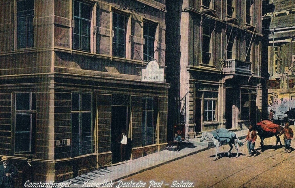
When philatelists discuss German stamps, the overprinted issues from the Ottoman Empire are a unique intersection of postal history, international relations, and currency exchange. German post offices in Turkey, established to serve German nationals and facilitate trade, offer an intricate story of stamp modifications driven by evolving requirements and local influences. Here, we explore the fascinating journey of overprinted German stamps used in Turkish territories, showcasing their progression through seven distinct issues.
The First Issue: Overcoming Currency Challenges
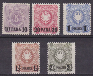
The first overprinted German stamps appeared on January 25, 1884. Prior to this, ordinary German stamps were used in Turkey, but they posed an unexpected challenge. Stamps were often purchased at face value and used for remittances to Germany, effectively bypassing money order fees. To address this, overprints were introduced, displaying approximate values in Turkish currency. This pragmatic moves curtailed misuse while appealing to local postal needs.
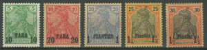
The overprints included the denominations of 5, 10, 20, 25, and 50 pfennigs, with “PARA” or “PIASTER” surcharged in black. Variations in design, such as differences in numeral spacing, make these stamps especially intriguing for collectors.
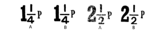
There are two types of the surcharge on the 1¼ Pias and 2½ Pias stamps
A: The middle of “P” in “PIASTER” is below the fraction bar.
B: The middle of “P” in “PIASTER” is above the fraction bar.
Stanley Gibbons Detailed listing.
- on 5pf. mauve
- on 10pf. rose
- on 20pf. ultramarine
a. blue surcharge (Apr) - 1¼pi. on 25pf. red-brown (A)
- 1¼pi. on 25pf. red-brown (B)
- 2½pi. on 50pf. grey-green (A)
- 2½pi. on 50pf. myrtle-green (A)
- 2½pi. on 50pf. grey green (B)
The Second Issue: Continuity and Refinement
With the release of new surface-printed stamps in Germany on October 1, 1889, the same values were overprinted for use in Turkey. These overprints closely resembled those of the first issue, with minor updates to typography. Notably, on higher denominations like the 1½ and 2½ piasters, the word “PIASTER” appeared on a separate line. These changes ensured clarity and facilitated the stamps’ use in diverse contexts.
Stanley Gibbons Nos. & Detailed listing.
9. 10pa. on 5pf. yellow-green
10. 10pa. on 5pf. blue-green
11. 20pa. on 10pf. rose
12. 1pi. on 20pf. ultramarine
13. 1pi. on 20pf. dull blue
14. 1¼pi. on 25pf. orange-yellow
15. 2½pi. on 50pf. lake-brown
16. 2½pi. on 50pf. chocolate

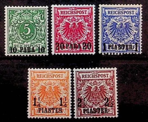
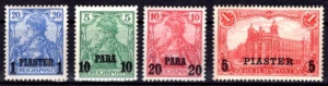
The Third Issue: An Expansive Overhaul
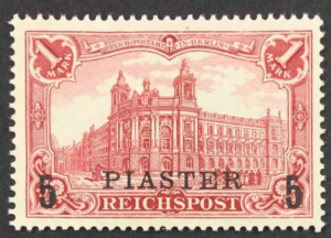
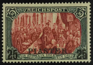
The 1900 pictorial “Germania” series introduced a broader range of overprinted denominations, marking a significant expansion in postal offerings. Overprints in Turkish currency appeared on stamps of up to five marks, reflecting the growing demand for higher denominations in the bustling commercial hubs served by German post offices.
This issue also introduced subtle changes, like the use of black or red ink depending on the stamp’s base colour. For example, the 3-mark stamp featured a surcharge in red, creating a striking contrast against its violet-black background.
Stanley Gibbons Nos. & Detailed listing.
1900 (10 Oct.) T 10 to 15 (“Germania”, G.P.O. or scenes) inscribed “REICHSPOST” surcharges.
17. 10pa. on 5pf. green
18. 20pa. on 10pf. carmine
19. 1pi. on 20pf. ultramarine
20. 1¼pi. on 25pf. black and red/yellow
21. 1½pi. on 30pf. black and orange/buff.
22. 2pi. on 40pf. black and carmine
23. 2½pi. on 50pf. black and lilac/buff
24. 4pi. on 80pf. black and carmine/rose
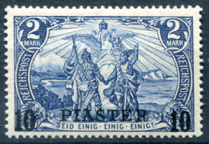
25. 5pi. on 1m. carmine
26. 10pi. on 2m. blue
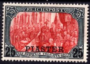
27. 15pi. on 3m. violet-black (R.)
28. 25pi. on 5m. lake and black (I)
a. Hand-painted borders (I)
b. Surcharge double
c. Type II
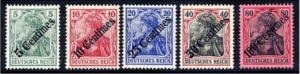
The Fourth and Fifth Issues: Typography Transformed
The Fourth Issue, debuting in 1903, featured a conspicuous serif on the “A” of “PIASTER.” This modification created a new visual identity for the stamps while maintaining functional consistency. Additional values, such as the 10 para, were later introduced, further diversifying the set.
1902 (25 Oct.)–04. Same stamps but surcharged with altered letter “A” with serif at top,
29 10pa. on 5pf. green (11.04)
30 20pa. on 10pf. carmine (11.04)
31 1pi. on 20pf. ultramarine
32 5pi. on 1m. dull lake (3.03)
33 10pi. on 2m. blue (9.11.04)
34 25pi. on 5m. lake and black (II) (4.03)
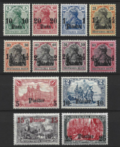
In 1905, the Fifth Issue adopted fancy Gothic script for the overprints, aligning with trends seen in German offices in Morocco and China. This change gave the stamps an aesthetic distinction, with numerals placed below the text for most denominations. The overprint on the 3-mark stamp was strikingly rendered in red.
1905 (1 Oct.) T 17, 18, 20, 21 and 22 (“Germania”, G.P.O. or scenes) inscribed “DEUTSCHES REICH” surcharges. No watermark.
35 10pa. on 5pf. green
36 20pa. on 10pf. carmine
37 1pi. on 20pf. ultramarine
38 1¼pi. on 25pf. black and red/yellow
39 1½pi. on 30pf. black and orange/buff
40 2pi. on 40pf. black and carmine
41 2½pi. on 50pf. black and purple/buff
42 4pi. on 80pf. black and carmine/rose
43 5pi. on 1m. carmine (26×17)
a. 25×16 perforation holes
44 10pi. on 2m. blue
45 15pi. on 3m. violet-black (R.)
46 25pi. on 5m. lake and black
Watermark (wmk) lozenges
The Sixth Issue: Paper Innovation and New Releases
Starting in November 1905 and until 1912, new stamps printed on paper with a lozenge watermark were issued, reflecting advancements in stamp production. The Sixth Issue saw the reappearance of previously issued denominations, with some delayed releases. The 3-mark denomination, for instance, only appeared in 1912, making it one of the later entries in this series.
47 10pa. on 5pf. green (5.1906)
48 20pa. on 10pf. carmine (6.1906)
49 1pi. on 20pf. ultramarine (6.1906)
50 1¼pi. on 25pf. black and red/yellow (3.1907)
51 1½pi. on 30pf. black and orange/buff (12.1905)
52 2pi. on 40pf. black and carmine (12.1905)
53 2½pi. on 50pf. black and purple/buff (6.1906)
54 4pi. on 80pf. black and carmine/rose (1.1906)
55 5pi. on 1m. carmine (3.1907)
56 10pi. on 2m. blue (5.1906)
57 15pi. on 3m. violet-black (1912)
58 25pi. on 5m. lake and black
The Seventh Issue: A Shift to Centimes
In August 1908, the Seventh Issue introduced a radical departure from the earlier series. For the first time, overprinted values appeared in “centimes” rather than Turkish paras or piastres. The overprints, applied diagonally in Gothic script, were a bold and unorthodox design choice. While the purpose of this set remains unclear, its visual appeal and rarity make it a sought-after addition for collectors.
Stanley Gibbons Nos. 60/64
Collecting Insights and Scott Numbers
Each issue in this series represents a milestone in philatelic history, with variations in design, typography, and overprint alignment offering endless opportunities for discovery. To aid collectors, here is a summary of the key Scott catalogue numbers for these stamps:
- First Issue (1884): Scott’s Nos. 1-6
- Second Issue (1889): Scott’s Nos. 8-12 & 12a
- Third Issue (1900): Scott’s Nos. 13–24
- Fourth Issue (1903–1905): Scott’s Nos. 25–30
- Fifth Issue (1906): Scott’s Nos. 31–43
- Sixth Issue (1906–1913): Scott’s Nos. 44–54
- Seventh Issue (1908): Scott’s Nos. 55–59
A Testament to Postal Diplomacy
The German overprinted stamps of Turkey showcase the role of postal systems as tools of diplomacy, commerce, and cultural exchange. Each issue reflects the challenges and innovations of its time, from managing fluctuating currencies to adapting to aesthetic and functional trends.
Have you come across any rare variations of these overprinted German stamps? Share your stories or photos in the comments below! And don’t forget to subscribe for more deep dives into the world of stamps and postal history.